As technology advances quickly, a gradual shift is transforming the way we approach digital design. Originally an artistic concept, minimalism has evolved into an effective ideology that is changing the way we interact with technology. Pixels align, colors merge, accessibility in ui ux and spaces breathe as you read this, all in the name of beautiful simplicity—a style that's becoming more and more common in user interface design.
Minimalism provides clarity in the face of overwhelming feelings and a lot of information. This design strategy demands attention rather than shouting for it. Minimalism attracts people with every purposeful addition and removal, producing experiences that are clean, clear, and distraction-free. However, why is this design philosophy taking off and why is it the preferred option for modern interfaces?
The user-centric design concept is at the core of this transformation. These days, with technology all around us, every interaction counts. By putting the user first, user-centric design makes sure that user interfaces are simple to use, interesting, and effective. The growth of minimalism is a deliberate decision motivated by the goal of user-centric design, not a passing trend. Minimalism is the remedy to decreasing attention spans and an abundance of interfaces; it offers better functionality, improved visual relief, and a smooth navigation experience.
Let's start by learning where minimalism in UI design originated before going into its more detailed aspects.
What is Minimalist Design in UX?
Minimalist layout prioritizes information and has a simplified interface with only the necessary elements. Its main tenet is less is more, as was previously noted. The final goal is to remove components from the user journey that are unnecessary or add little to no value. The ideal combination of aesthetics and visual communication is found in minimal design. Setting the important components on the screen in order of importance is important. Depending on your intended message and brand niche, several color palettes may be used. More correctly, without the use of unnecessary details and gimmicks, the information is conveyed directly.
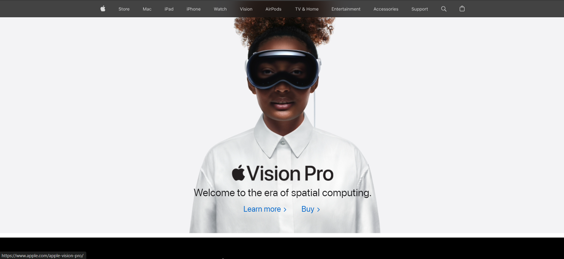
The Apple website is an excellent example of UX minimalism in design. The interface is simple, emphasizing only the most important components. A user-friendly interface makes use of plenty of white space, a restrained color scheme, and simple navigation. Users may quickly and easily access vital information without being distracted by extraneous decorations or distractions because to the thoughtful placement of important components like product information and images.
Few aspects of minimalism
Everything nowadays revolves on aesthetics. It isn't working if it isn't attractive. Aesthetics is the primary factor that separates good designs from bad. Because of this, designers have chosen to go with a simple, easily navigable layout. A simple website design will always enhance its visual appeal. Minimal UX design is more recognizable to users, which improves conversion rates. Experiences are what you should aim for from a business point of view, but they also need to be well-designed.
Simple and quick navigation
The main focus of the content is on minimalist UX design. The screen does not include the unnecessary information. As a result, visitors to your website may quickly and simply locate what they need to do to finish the tasks they came for. In the same approach, the minimalist app may be made.
Users are less likely to leave your website when it has a minimal design. The simple navigation enhances the user experience as a whole.
User first
Since the minimalist ux design is content-focused, it becomes user-first as well. The user's attention will be drawn by the attractive design and strong language. Content on your website has a greater communication role when you concentrate exclusively on the essential components.
Quick loading of pages
Since there are fewer components overall in a minimalist website design, your website page will load more rapidly. This gives your company a competitive advantage. If a website takes even a second longer to load, users usually quit it right away. In the end, minimalist UX design is advantageous to you.
Simple responsive layouts
You should just include the content and components that are most important on your website's basic design. Thus, creating a responsive website is simple. As such, building a simple responsive website won't need a lot of work or time.
Practices of minimalism in digital design
One of the most popular design trends for websites and mobile applications nowadays is minimalism. The following techniques can be used to describe the key aspects to keep in mind.
Monochrome or limited color scheme
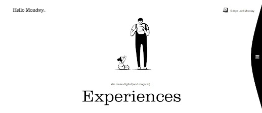
Color psychology in interface design is important because it can help users connect on an emotional and educational level. To maximize the visual impact, minimalist designers frequently choose monochromatic or a limited range of colors in their color palettes. This method keeps people from becoming distracted by too much variation by letting certain hues stand out. This strategy guarantees a focused user experience and works especially well for interfaces that guide users towards specific goals like making a purchase, subscribing, contributing, or starting use.

Image: mockitt.wondershare
Flat design
As we mentioned in our earlier piece, flat design has emerged as a strong advocate for minimalism in modern electronic products. The use of flat, two-dimensional visual features as an opposite of incredibly realistic and detailed skeuomorphic visuals is the direction's primary characteristic. Flat photos typically don't use highlights, shadows, gradients, textures, or many curves. Using this method makes it possible to create graphics, buttons, and pictures that appear well at all sizes and resolutions. It enables designers to improve user interfaces' usability and visual clarity.
But, as often the case these days, the terms "flat" and "minimalist" shouldn't be used together. They are not equivalent. "Flat" refers to the way that gradients, textures, shadows, and other visual components of the interface are used for buttons, illustrations, and other visual elements. The term "minimalist" refers to a much wider range of topics, including layout in general, composition, color scheme, contrast, and all visual performance methods used in it. Therefore, one of the design strategies used in the minimalist approach to interface creation is flat.
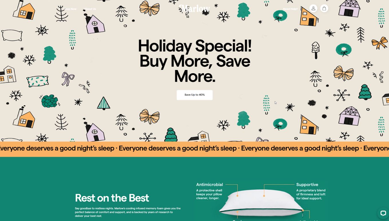
For instance, consider the website marlowpillow which effectively makes flat design principles to create a clean and uncluttered user interface. A minimalist design is made easy by the lack of unnecessary information, textures, and shadows, which also make the experience easier and user-friendly.

Image: alvarotrigo
Choice limitation
Enhanced user concentration is one of the benefits of interface simplicity. Because these pages and screens are centered on functionality and simplicity, they typically support a high attention ratio and enable users to quickly solve problems and navigate the website or app. They also don't overload users' attention with decorative elements.
Grids
The grid system in minimalist interfaces can be effective for making the layout look highly-organized, especially if the website presents a lot of homogenous content. Another benefit is that grids are responsive-friendly.
Including negative space and adding air
White space (also called negative) in digital design is the term which is more about space rather than color. In minimalism, it is one more effective way of adding elegance and marking out the core elements. Also, in terms of monochromatic or limited color palette, white or negative space plays a big role in creating enough contrast and supporting legibility.
Practical Examples of Minimalist User Interface Design
Google is good example for minimalism
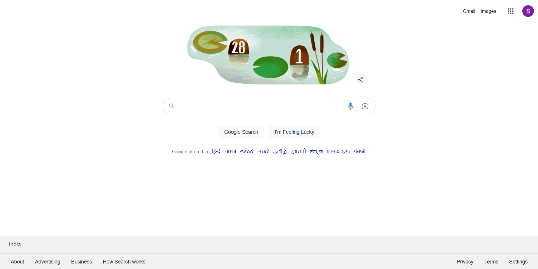
Glancing over to Google, we discover yet another example of a clean user interface. With its Material Design system, Google has embraced these ideas, producing interfaces that put an emphasis on simplicity of use and clarity. This method places a strong emphasis on grid layouts, structure, and user-guided animations.
Take, for instance, the UI of Google Calendar. Its simple layout makes managing schedules easier for users, demonstrating how usability may be improved by keeping things simple. Additionally, the famous Google search engine is a prime example of minimalism's power. The core point of contact, the single search bar, embodies the ideal of combining practical aesthetics with simplicity.

Apple
Apple is a leader in minimalist user interface design. Their emphasis on ease of use and simplicity is evident in all of their products. Consider Apple's elegant, simple interfaces that place a premium on clear lines and simple, intuitive gestures. This strategy is used to all of their hardware and software, resulting in user interfaces that deftly blend style and functionality.
Everything in Apple's design philosophy is minimalistic, even down to the usefulness of AirDrop. This feature offers a simple and easy method for transferring files without any problems. With only a few easy clicks, users can transfer material between devices, showing how simplicity can improve usability and functionality.
The UI is purposefully set up to lead people in a natural way. Usability is improved by clear lines, strategically positioned features, and dependable typography. This results in an interface that looks fantastic and feels tremendously simple to use.

Hire minimalist design expert.
Creating minimalist designs is challenging. Fear not, our experts at sketchish assist you in shaping your digital product journey. From concept to launch, We design great user interfaces. During the design phase, our team of experts guarantees quick iterations. Whether you're starting or refining, sketchish is here to guide you.
Explore our case study for insights into our process and results.


