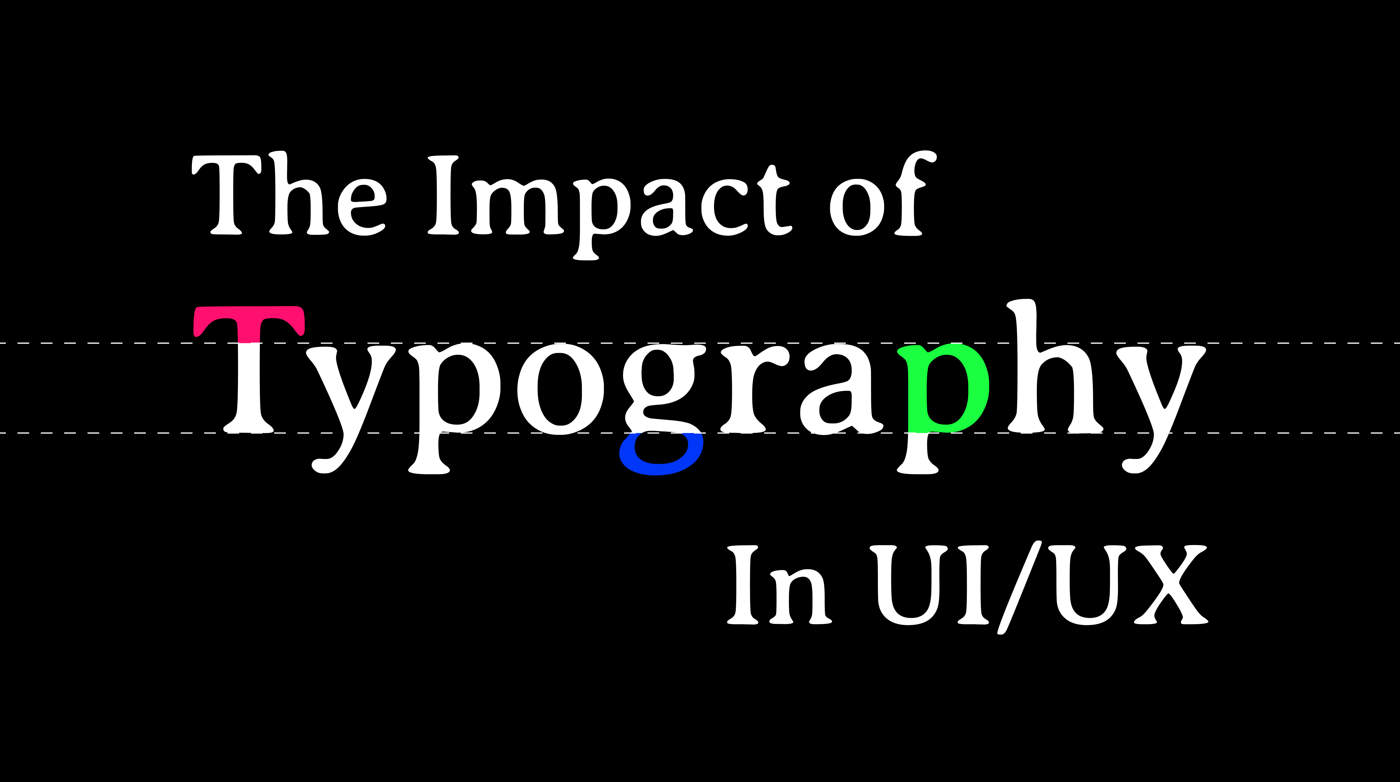
Typography is the art of using fonts to make your interface come to life, and it goes well beyond simply selecting a beautiful font for your website or application. When dealing with typography, there are several factors to take into account, such as readability, accessibility, and hierarchy. Depending on how you utilize typography, your interface may be decent or amazing.
1. First off, what is typography and why is it important?
Typography, which dates back to the 11th century, is the practice of using typefaces and fonts to create writing that is readable, clear, and attractive to the eye. Typography consists of font look, style, and structure with the goal of communicating particular messages to the reader and creating particular feelings. In addition to making sure the typeface complements the website's or app's visual balance, the UI designer's role is to maximize accessibility for the website by maintaining highly accessible typography.
Good typography will not only make user interfaces more vibrant, but it will also:
Influence decision-making by seeing how users adopt and interpret the information presented in the text; Develop to communicate particular messages to the reader and create to communicate particular messages to the reader and create brand recognition by gently urging users to identify your brand with the typeface used on your website; and Capture readers' attention by being memorable and important.
Career Foundry UI design mentor Olga lifts the lid on why typography matters—and what difference it makes for your users.
2. What role does typography play in UI/UX design?
Typography plays a crucial role in creating a positive user experience and reflecting a brand's identity. In the context of a design system, which guides the consistent look and feel of a digital product, typography becomes even more vital.
A well-crafted typography ensures that text elements are clear, readable, and aligned with the brand's voice. This consistency across screens and devices helps users navigate content effortlessly and fosters a sense of familiarity.
Moreover, typography contributes to scalability and adaptability. Designers can easily adjust typography styles to fit different screen sizes and maintain readability across platforms.
By highlighting the importance of typography, we underscore its role in enhancing user experience, reinforcing brand identity, and ensuring a seamless visual experience across digital touchpoints.
You may like: Most trending UI/UX design in 2024
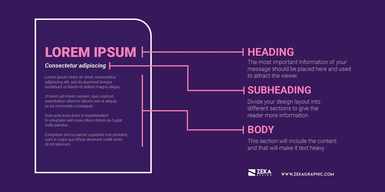
3. What are the different elements of typography?
Before we get to the practical part, let’s remind ourselves of the different elements of typography:
Fonts and Typefaces
impacting the user experience and overall aesthetics. Selecting the appropriate mix creates visual hierarchy, communicates brand identity, and improves readability. Typographic consistency fosters a unified design language, although changes can be purposefully used to draw attention to particular sections. In order to create an interface that is both entertaining and easy to use, style and readability must be balanced.
Consistency
It improves readability, brand identification, and visual harmony. Clear navigation via interfaces is made easier by consistent fonts, which also offer a smooth user experience. Keeping to a single typographic style helps designers create a uniform, polished appearance that builds user confidence and engagement. Carefully selecting and applying fonts to the user interface will result in clear communication and a professional appearance.
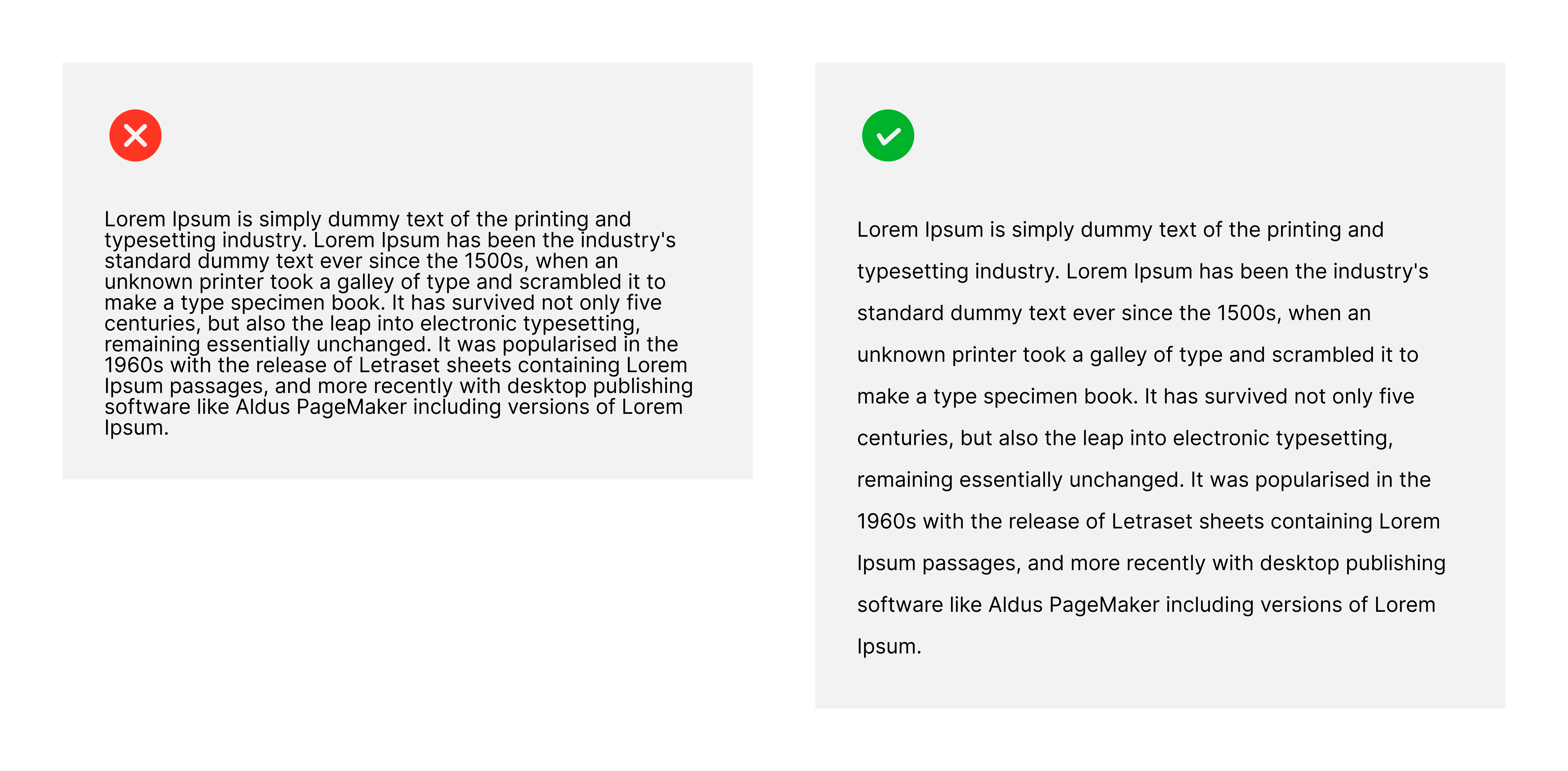
White space
Making the most of white space, also known as negative space, is essential for improving readability and aesthetic appeal. A balanced and well-organized layout that lets users concentrate on important aspects can be created through the thoughtful use of white space. The user experience is further enhanced by appropriate typography in this area, which guarantees clarity and readability. Aesthetically pleasant and user-friendly interfaces require a healthy balance between text and white space.
Alignment
Users can navigate material more easily when there is consistent alignment, which produces an organized layout. Alignment affects the user experience overall, whether it is justified for a tidy appearance, centered for balance, or left-aligned for a more formal appearance. Finding the ideal balance assures an effective and clear user interface, creating a favorable impression and promoting efficient communication.
Color
Color psychology is one of the most important parts of typography. The three main components of color are saturation, hue, and value. In order to make the text visually appealing and easily readable, especially for those with vision problems, a skilled designer will know how to strike a balance between these three elements.
Hierarchy
One of the most important typographic concepts is hierarchy. Typographic hierarchy aims to create a clear visual hierarchy between regular text copy and exceptional material that should to be noticed and read first.