
Before we could access the internet on our smartphones and tablets, things were easier. In order to have an online presence, a website has to be designed with a desktop and maybe a laptop in mind. These days, however, a wide range of screen sizes must be taken into account and supported, from bigger desktop and laptop displays to tiny mobile phone and tablet screens. This is especially important since users will immediately navigate away from a webpage if it doesn't appear correctly on their chosen device.
Responsive design and adaptable design are the two ways to make sure a website is optimized for displays on smartphones, tablets, laptops, and PCs. Even though both aim to address the same issue, they use distinct approaches.
Making the right choice for your next UX project will be made easier if you understand how both of these methods differ from one another.
What is responsive design?
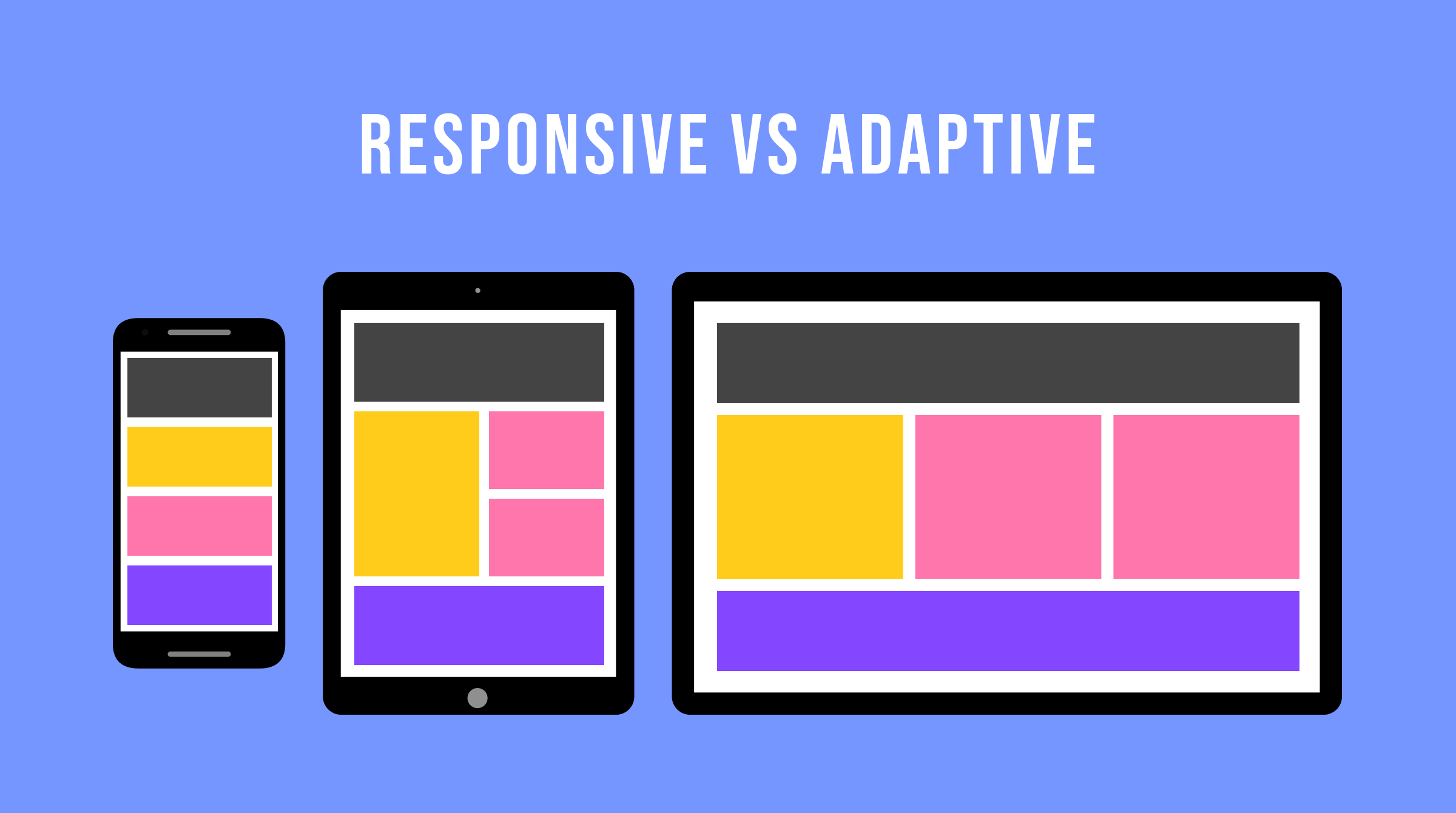
When a website is designed using responsive design, its elements "responsively" change to match the screen of the device being used to view it. This allows the layout to work for both desktop and mobile users.
The secret to building flexible websites, which are usually created with HTML and CSS or HTML5 and CSS3, is to use queries to target breakpoints, or places on a page where the layout changes to accommodate varying device sizes. These breakpoints suit the layout on all screens, wrap text, and scale pictures.
Image Credit: creativemarket
What’s adaptive design?
For adaptive sites, designers create numerous fixed layouts to match the device a site is viewed on.
Different layouts for various screen sizes are used in adaptive design, typically with templates for the resolution of each device. Layouts for the six most popular widths—320, 480, 760, 960, 1200, and 1600 pixels—are frequently created by designers. Content needs to adjust to different resolution ranges on tablets, smartphones, smartwatches, and displays in order to be displayed correctly.
The positive and negative's of responsive design
Designing adaptable layouts might sound complex, but it's a bit simpler for UX designers. They just need to craft blueprints for each screen size, ensuring the experience feels tailor-made for any device. This method also makes room for weaving in accessibility features, making sure the website is easy and enjoyable for everyone to use, regardless of their device.
Let's take the example of an online store. On a big desktop screen, you might see a bustling homepage with lots of product categories, best-sellers, and sale banners. But on a mobile phone, the design shifts to something simpler: a prominent search bar, a list of recently viewed items, and a neat menu to zip through the site. This adaptability doesn't just cater to the device's screen size; it also considers how to make the site accessible and user-friendly for everyone, adding features like bigger buttons for touchscreens and text descriptions for images.
Adaptive designs are speedy because they only load what's necessary for your specific screen, making them a breeze for developers to work with. Plus, keeping accessibility in mind means everyone gets a fast, smooth experience without unnecessary delays.
However, crafting these adaptive designs, especially with a keen eye on accessibility, can be a bit of a puzzle for UX designers. If you only design for a few screen sizes, you might miss out on providing a good experience for an uncommon screen size. Ensuring that accessibility features work seamlessly across different devices adds another layer of challenge, but it's crucial for making sure everyone can navigate and enjoy the site just as intended.
Responsive or adaptive design: which is better?
Ultimately, no matter the design approach you choose, the most important thing is to prioritize your audience. It is simpler to design with them in mind when it comes to various layouts, content, and other aspects of the website once you have a clear understanding of their demographic and the devices they often use to access it.
Image Credit: interaction-design
It will also primarily depend on whether you're beginning from scratch or whether you have an existing website to work with. It's estimated that 1/8 of websites already employ responsive design, which has become the standard design style (but there's little to no statistics on how many use adaptive). The pace of adoption of responsive websites is also increasing significantly, nearly matching that of standalone mobile websites.
Taking all of things into consideration, it's reasonable to state that responsive design is typically the method of choice—if only due to the constant effort that adaptive design requires.
However, a research conducted by Catchpoint suggests that adaptive could be the better choice if a customer or organization has the budget. They used WordPress to create two different websites: one with the default Twenty Fourteen responsive theme and the other with the help of the Wiziapp plugin.
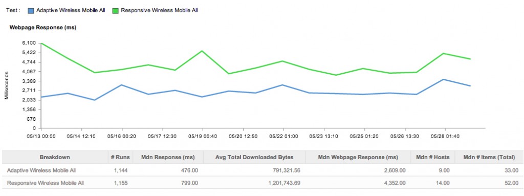
Image Credit: catchpoint
Depending on the device a user is using to view the website, the plugin displays a mobile theme to them. It also provides advanced configuration options to help you further optimize the process.
While it should be noticed that no optimization was done, this does demonstrate that the responsive site is downloading all necessary files for the desktop machine. Thus, the theme doesn't provide a very strong performance out of the box.
While media queries may again be used to get around this, the example above shows why responsive UX design isn't always the greatest option for smartphones, despite its popularity. It's hard to know what we can do about it other than learn how to properly code and put together a fantastic responsive site, though, until something better comes along.
So what's the verdict?
It's possible that responsive design will continue to be popular because we haven't come up with a good way to handle the extensive upkeep that adaptive design requires. Despite the web's apparent fondness for responsive design, adaptive web design is still relevant, so it's possible—at least in theory—that new advancements in this field will surpass the capabilities of responsive web design.
Conclusion
Wrapping up, navigating the choice between responsive and adaptive design is a bit like choosing between a Swiss Army knife and a set of specialized tools. Responsive design offers a one-size-fits-all solution that makes your site look good on any device, kind of like the handy Swiss Army knife you can carry everywhere. Adaptive design, on the other hand, tailors the experience to the device, much like reaching for just the right tool for a job. Both approaches have their place, depending on what you’re building and who you’re building it for.
Here at Sketchish, we get that it’s not just about making choices—it’s about making the right choices for your audience and your project. Whether you’re kicking off a new idea or giving your current site a facelift, we're here to walk you through it, taking a close look at who your audience is and how they’re connecting with you. We’re all about crafting experiences that aren’t just seamless but also genuinely enjoyable, no matter the device. Choosing between responsive and adaptive? Let’s figure it out together. After all, building something amazing is what we’re here for.


