Among many other UI aspects, color psychology is a valuable tool in UX design for buttons, navigation, and call to action (CTAs). All of these components are crucial for building brand contact with consumers and motivating them to make a purchase. Color is used in both UX and marketing since it's thought to be the aspect that's easier to remember when encountering something new.
What is Color Psychology in UX Design? is an article. The work Improving User Experience With Colors discusses how people's psychology is impacted by color, with effects on user experience design, marketing, sales, and conversion rates.
Do you know what are some most trending ui/ux design? If yes then share most trending design to us to get a featured on sketchish.
Color Psychology In UI/UX design
As I've already said, colors are a common component of UX and marketing. This may be explained simply: when they activate our eyesight, which is directly linked to the brain, feelings and reactions are triggered right away. Organizations use color psychology to affect their target audience since studies have shown that different colors are associated with particular emotions.
• Using the appropriate color combination may make your website or design stand out by drawing the user's attention.
• Users' purchasing decisions are significantly impacted by visual aspects.
• People can assess something through color alone (important tip to remember for brands and products)
• A study showed that magazine readers can recognize a full color ad compared to a black and white ad
• A change of color in the advertisement alone can increase sales
These claims showed the wide range of effects that color has on individuals. According to psychologists, a product's color impression may determine whether it is accepted or rejected by 60%. As a result, an unattractive color scheme might have the same impact on the user experience as poor writing or a slow-loading website.
What is Accessibility in UI/UX Design?
How can colors create emotions and grab attention?
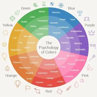
Choosing the right color or color combinations to enhance the look of your website or product may be difficult given the wide variety of colors and color combinations available. Here are a few key pointers has compiled for your UX design. See the psychology of color information below to find out what each hue means:
Red: To draw attention and convey a sense of urgency, red is frequently used in sales promotions and clearance signage.
Blue: Corporate logos and websites often use blue to convey trust and professionalism. Social media platforms like Facebook and Twitter also use blue prominently.
Yellow: Yellow is commonly used for caution signs and in the branding of energy drinks to evoke a sense of energy and excitement.
Green: Health food products often use green packaging to convey a sense of natural freshness and well-being.
Orange: Fast-food chains like McDonald's use orange in their branding to create a vibrant and energetic atmosphere.
Purple: Luxury brands, such as certain perfume or fashion lines, use purple to convey sophistication and exclusivity.
Black: Luxury car brands often feature black in their logos and designs to convey a sense of elegance and power.
White: Apple products are often associated with white, emphasizing purity, simplicity, and a clean design aesthetic.
Brown: Coffee brands often use brown in their logos and packaging to evoke a sense of warmth and earthiness.
Pink: Products targeting a younger, more playful audience, such as children's toys or certain cosmetics, often incorporate pink.
Gray: High-end electronics, like laptops and smartphones, often feature gray to convey a sense of sophistication and modernity.
Gold: Luxury brands, jewelry, and award ceremonies often use gold to signify prestige, success, and opulence.
How do brands use color psychology
The colors you see in today's major brands are not accidents. They all utilize color psychology to ensure that their logos are quickly and easily recognized by their target audience. Businesses acquire their brands in this way. Here are a few instances of companies using color psychology:

McDonald's brand color is yellow, which conjures up feelings of joy and optimism. Barbie and Victoria' Secret both utilize the color pink to appeal to women. As was previously said, pink is linked to children and femininity. The logos of Facebook and PayPal prominently include the color blue, which denotes reliability and stability. Black is used in the logos of the New York Times and Prada to signify strength, elegance, and refinement.
However, there are other components of branding than color. Schemas are also frequently used by experienced UX professionals to ensure that they convey the intended message. Consider Google, who consistently ensures that all of its designs match to the color schemes specified in its standards.
However, some corporations also employ color to challenge expectations and minimal ui ux. For instance, some businesses employ specific colors in their advertisements to convey a message. Certain firms alter or improve their recognizable brand color to elicit a certain response from their user base.
Do not misunderstand how colors and schemas function. These are both crucial components of UX design. Schemas are employed to challenge a user's impression of a brand or product, while color psychology manipulates the user's emotions to have an impact. You may experiment with these two components to help your audience remember the message, provided that the "message" stays with them.
Conclusion
In conclusion, color psychology influences feelings and branding, making it essential to UX design. Colors are a tool that brands intentionally employ to communicate with consumers and deliver messages. Instances such as Facebook's dependable blue or McDonald's cheerful yellow demonstrate the significance of color selections in effective branding. Color is only one component, but it shapes holistic user experiences together with schemas. Understanding meanings and effectively using them to elicit desired emotions and reinforce brand identification are key components of mastering color psychology.
If you reach this far then typography impact on UI/UX is the bonus thing you should like to know.
Share on: